Design System
TLDR
Managing 20+ brands manually was slow and caused constant "theme debt." I rebuilt the system from scratch using Figma Variables to automate brand-specific UI. This eliminated manual syncing and cut design-to-dev handoff time by 50%.
Industry
iGaming
Role
Product Designer
Timeline
8 Week Sprint

Overview
Following a team restructure, the legacy design system became unmanageable. It relied on manual overrides for every new operator, leading to frequent colour errors and mounting design debt. Inspired by the Lloyds Banking Group talk at Config London 2025, I spent Q4 rebuilding a leaner, automated framework from scratch to ensure a single designer could support a multi-brand ecosystem.
Research
The primary objective was to eliminate manual overrides, the root cause of handoff friction and human error. I audited the existing components to identify where mapping failed. Due to the lack of component-based colour tokens, we were reliant on a fragile mix of swap libraries and manual accessibility fixes.
Pain Point 1
Overriding the master library for every brand was slow and led to inconsistent colours.
Pain Point 2
Devs and QA spent too much time hunting for components or asking how things worked.
Pain Point 3
As a solo designer, I couldn't spend half my week on upkeep; I needed a "set and forget" system.
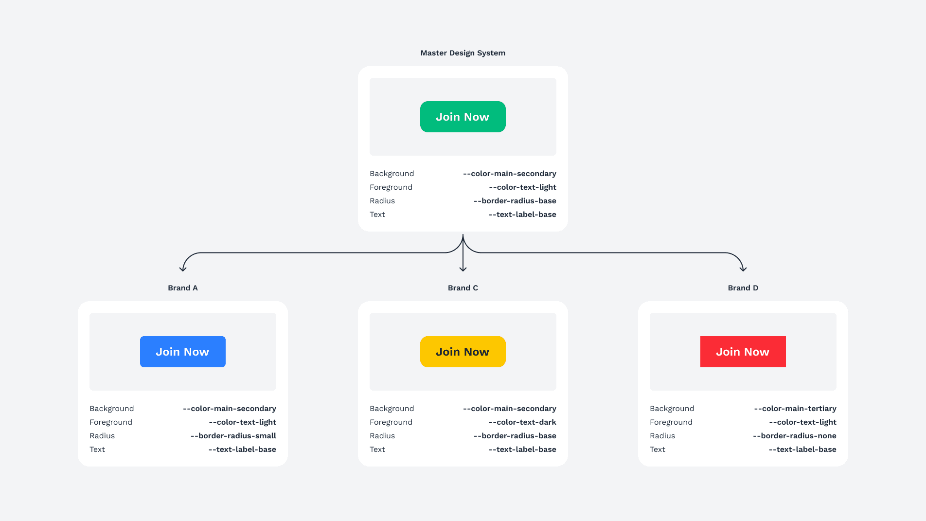
To resolve this without impacting wider company roadmaps, I proposed a shift to a Master & Instance architecture where the master library is duplicated per operator. This pragmatic approach provides a dedicated Source of Truth for every brand, removing the guesswork and inconsistencies that previously required daily manual intervention.
Architecture
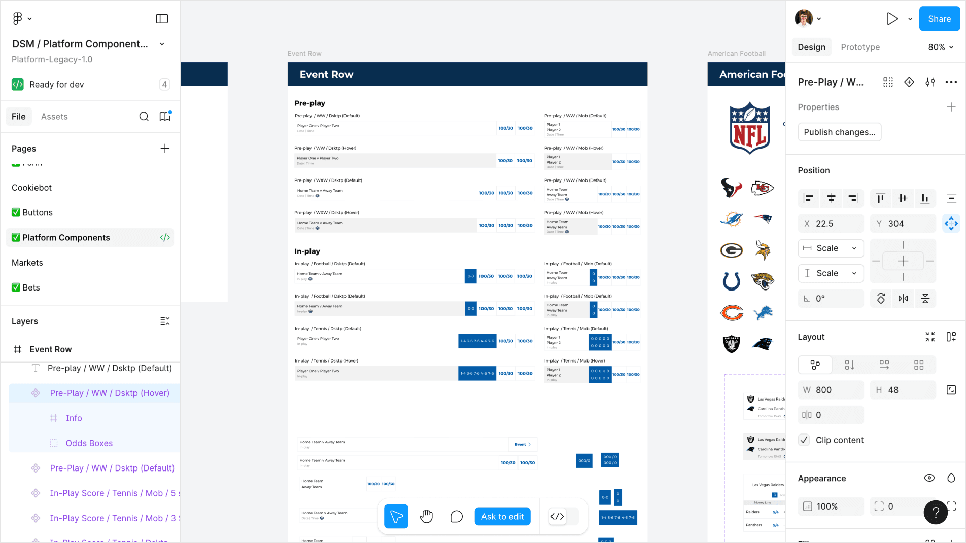
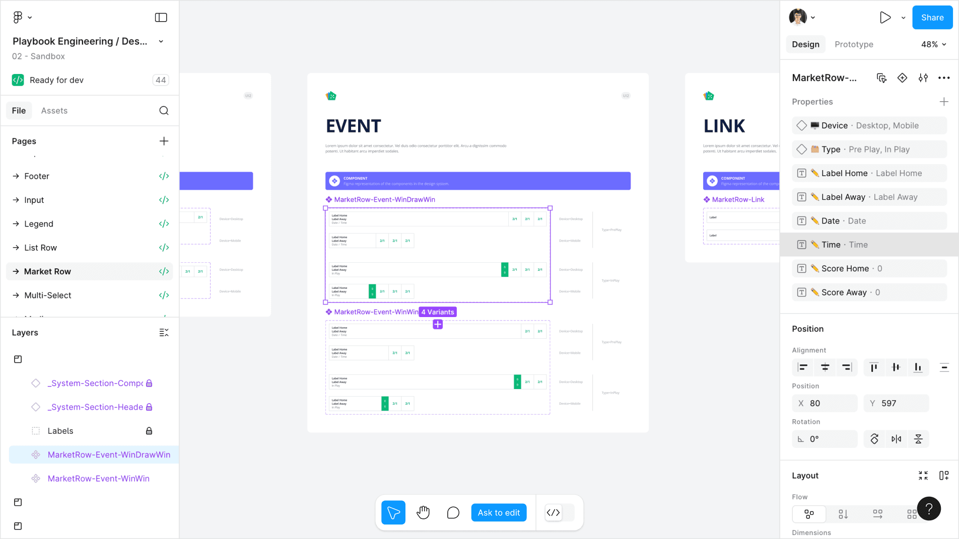
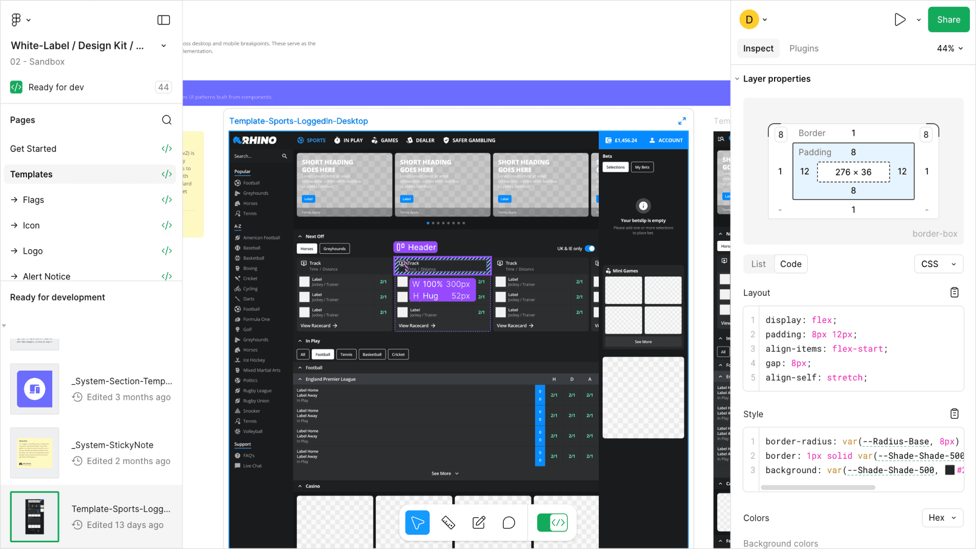
I led the transition to a modern framework, leveraging Figma Variables and Auto-Layout to automate the swap library workflow. By building with a "Master-to-Operator" file structure, I ensured that spacing and radius remain globally consistent while brand-specific themes are locked into their respective libraries. This setup provides the necessary guardrails for accurate screen reproduction across a complex, multi-brand estate.
Visual Design
I focused on engineering robust, "utility-first" components that are built to work for any brand out of the box. To streamline the handoff, I utilised component properties to reduce layer nesting and integrated on-canvas labelling with detailed component descriptions. This creates a self-documenting system where the UI logic is visible to the developer, ensuring the core usability remains identical regardless of the visual skin applied.
Usability Testing
I treated Dev and QA as my primary users. I performed Figma swap library tests to ensure no components broke during brand transitions, then asked QA and Developers to inspect the files as they normally would. This verified that the on-canvas documentation and component descriptions were clear enough for the team to implement designs without needing a formal walkthrough.
Outcome
By year-end, we eliminated the need for "on-the-fly" manual overrides. Engineering velocity has increased because the source of truth is now documented per brand. I successfully transitioned the workflow from a clunky, manual process to a scalable model that allows a solo designer to manage a complex, multi-brand estate.
Learnings
This project reinforced that the most technically "perfect" solution isn't always the right one. By choosing a reproduction-heavy model that avoided dev dependencies, I solved the immediate bottleneck and delivered a stable, high-performance system for the team.